Google Suite Accessibility
 Google Drive is great for sharing documents and media, but Google Docs is missing a few key accessibility functionalities. If you need to convey a lot of data in a table, have complex tables, or complex equations, then Microsoft Word will be a better choice. Collaborating and co-editing a Google Doc can also be challenging for users of assistive technologies. For a very short guide on how to make your Google Docs accessible go to make your document or presentation accessible.
Check the following elements and ensure they are accessible
Below are accessibility guidelines for common elements that you might have in your Google Doc. Click on the relevant tabs to learn more about each element and ensure that your formatting and content can be read by assistive technologies.
Text
Use a text font that is easy to read.
- Ensure your text is readable by using at least 10pt san serif fonts, such as Arial, Helvetica or Verdana. These font types will magnify well for those who have low vision.
- Note: If there is an image with text in it, make sure to add that image text as alternative text, so that a screen reader can read the text to blind students.
Headings
Use properly formatted headings to structure the page. It isn’t enough to make text big and bold to “look” like headings. They need to be formatted as headings. Otherwise, a screen reader will not detect that there are sections on the page and allow a user to jump to the section they want to read.
- Select the text that you want to make into a heading.
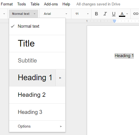
- Go to the Styles menu (probably says “Normal text”) and click the down arrow to activate the menu.

- In the Styles menu, choose the appropriate heading level from the Styles gallery.
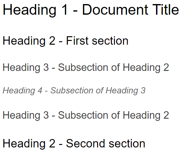
Note that headings also need to be used in the correct order. Headings chunk out your content, making it easier for everyone to read. Headings must be used in the correct order for them to be useful. Do not skip heading levels.
Lists
Lists also need to be properly formatted so that a screen reader can let the student know that there is, for example, a “list of 2 items.” To format a list properly:
- Select the text that you want to make into a list.
- In the Toolbar across the top of your Google Doc click the Numbered or Bulleted List button

Alternatively, go to the Format menu, choose Lists and then select Numbered or Bulleted list.
Images
Provide alternative text descriptions (ALT text) for images, including graphics, graphs, maps & shapes.
Alternative text descriptions of images (ALT text) allows screen reader users to benefit from the information being conveyed by an image. Unfortunately not all screen readers are able to read Google Docs’ image alt text, so consider adding a caption or description in the page content to ensure all users benefit from the image information.
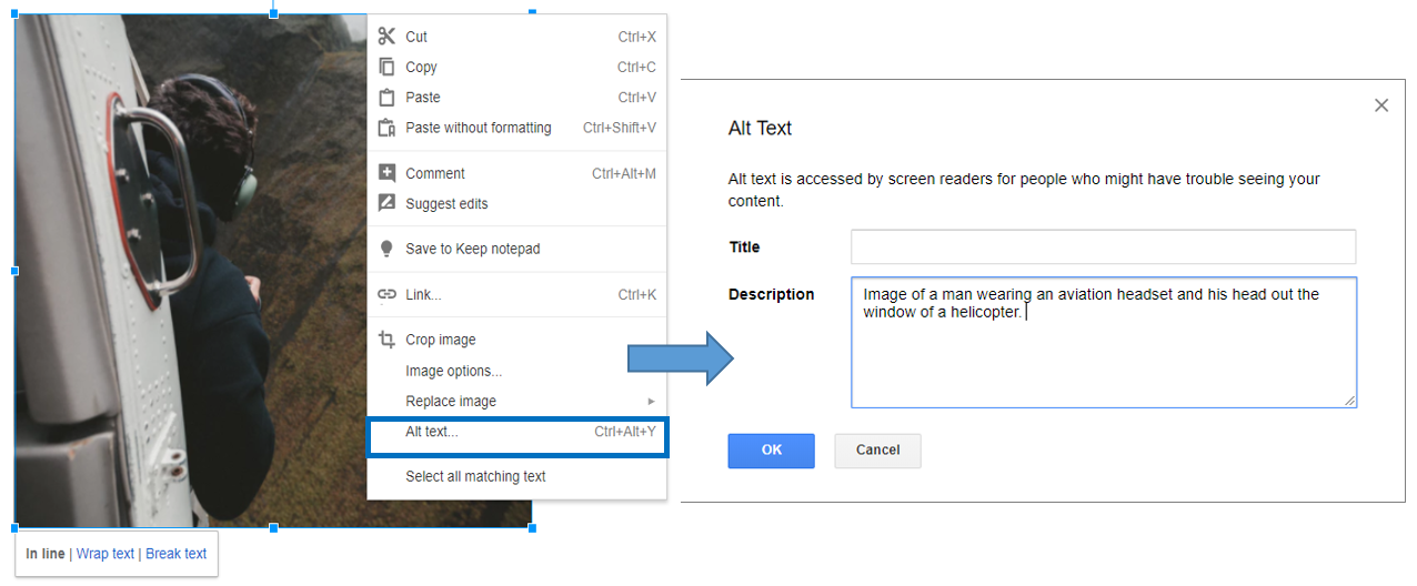
- Click on the image to select it (a blue border will appear).
- Right-click on the image (Cmd + Mouse Click on a Mac).
- Select Alt text from the menu.
- Type in description text in the Description field (not in the Title field).
- Click the OK button when done.
See Complex Image Accessibility for images that cannot be adequately described sufficiently in alternative text.
Links
Screen reading software allows a user to hear a list of all the links on a page at once. This helps the user find a specific link quickly. If the link is some indecipherable URL or ambiguous phrase like, “click here” the screen reader user will not know where that link goes.
To write meaningful link text that indicates the link’s destination:
- Type out text that describes the destination of the link. Example: Portland Community College.
- Select the text.
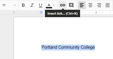
- Select the Insert link button (Ctrl/Cmd + K).
- Alternatively, you can go to the Insert menu and click the Link option, or right click on the selected text and click Link.
- The Link window will open. Type the URL of the webpage in the Link field. For the example above, we would type out, “https://www.pcc.edu”. Alternatively, you can copy/paste the url of the website from the address bar of your browser.
- Then click the OK button to save the link.
Hyperlink Tips
- If you think students will be printing the document and you want them to have the URL, put it in parentheses after the link, but don’t let Google Docs automatically create a link.
- Example: Portland Community College (www.pcc.edu).
- If it is a long url, consider shortening it using TinyURL or Google URL Shortener.
Tables
Create data tables with Column Headers
Designating column or row headers in a table is essential to screen reader users understanding how the information is laid out. Google Docs doesn’t allow you to designate column or row headers, so keep your tables small so they are understandable without headers.
Ensure proper reading order in tables
Screen readers read tables from left to right, top to bottom, one cell at a time (no repeats). If cells are split or merged, the reading order can be thrown off.
To test the reading order of your table, place your cursor in the first cell of the table. Now press the Tab key repeatedly to navigate through the table. This will be the reading order that assistive technologies will use.
Merged, nested, and split cells change the reading order of tables. Make sure you construct your table in a way that accommodates good reading order.
Color
Don’t use color alone to make a distinction, a comparison, or to set something off or apart from the rest of the document. If you categorize something by color alone, those who are color blind or blind will not be able to benefit from the information.
Use sufficient Color Contrast
Make sure there is enough color contrast between foreground (font) color and background color.
If you print your color graphic on a black and white printer, would it be understandable? Without sufficient color contrast, people who are color blind will not be able to benefit from the information. Keep in mind that PCC’s standards are to pass the WCAG 2.0 AA standard.
How-to Install and Use the Colour Analyzer tool
- Download Colour Contrast Analyzer Tool
- Open the Colour_Contrast_Analyzer application
- Make sure you are in the Result — Luminosity mode, not the contrast result for color blindness.
- Click the Foreground eye dropper tool, hover over and click the foreground color to select it.
- Click the Background eye dropper tool, hover over and click the background color.
- If you have a 12 pixel font color you are testing for color contrast, you must get a Pass (AA). If you have font larger than that, you must get a Pass (AA) in the Large Text field.
Video: How-to Install the Colour Contrast Analyzer
Video: How to use the Colour Contrast Analyzer tool
Equations/Formulas
Math and Science equations and formulas cannot be written accessibly in Google Docs. See Math & Science accessibility page
Additional Resources
- Get started in Google Docs with a screen reader
- Use a Braille display with Google Docs
- Google Docs accessibility for iPhone and iPad
- Grackle Docs
- Grackle Sheets
- Grackle Slides
- Digital Accessibility with Grackle
Accessibility Checker for Google Docs
Grackle Docs is an accessibility checker for Google Docs. It’s an Add-On for the Chrome browser. Download the Add-on and then in any Google Doc, go to the Add-Ons menu and select Grackle Docs and then select Launch.
