Accessible Syllabus
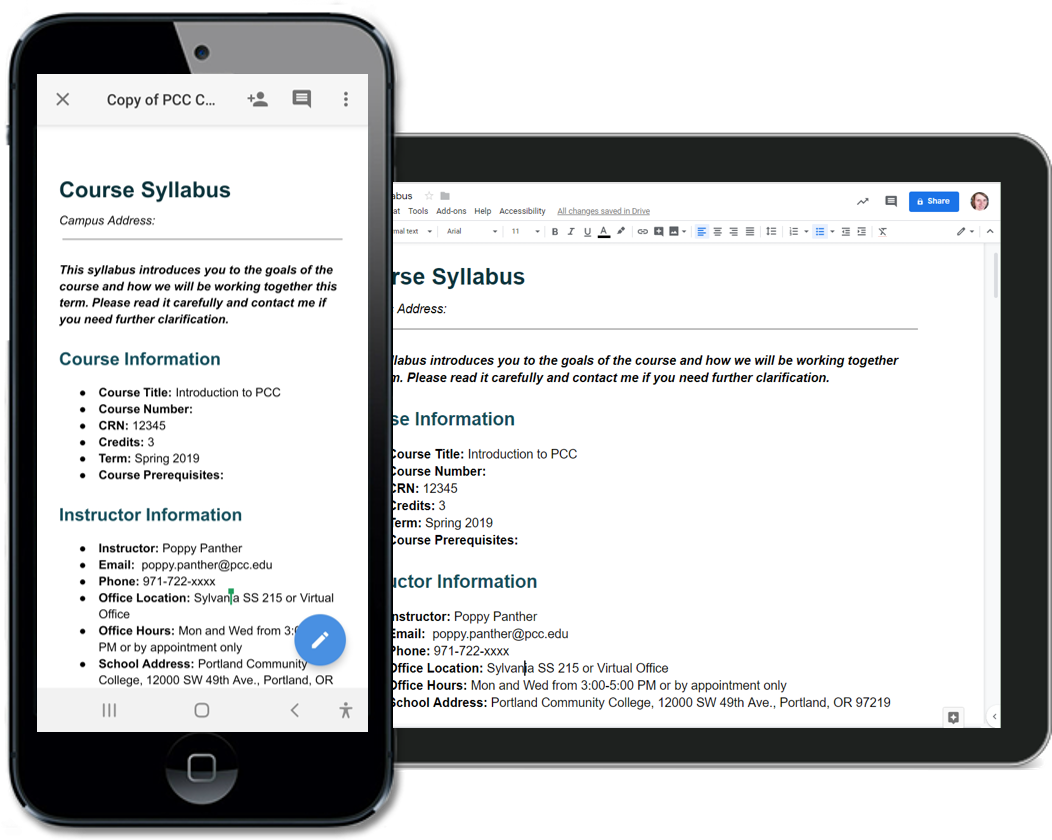
 As part of the Accessible Technology Policy, faculty are required to ensure that their course documents are accessible, including the syllabus. Below is an example of an accessible syllabus with proper heading structure, formatted lists, meaningful links, etc.
[Google Doc] Grayscale Course Syllabus Example
- To use this example as a template, go to File and select Make a Copy.
- You can easily customize the text style of headings in Google Docs. Format one heading level, update the heading level to match selection, and the entire document updates!
- Feel free to customize the document to fit your needs. This is only an example.
- If you’d like a Word document, go to: File → Download → Word.
If you are unsure as to what is required in a PCC Syllabus, take a look at the Syllabus Standards for Credit Courses.
Required Formatting Elements
There are a variety of applications that can be used to create a syllabus such as Microsoft Word, Google Docs, D2L Brightspace, and Adobe Acrobat. Regardless of the application you choose, make sure the following elements are formatted correctly.
 Headings
- Lists
- Meaningful links
- Tables with column/row headers
- Images have alternative text
- Grade calculation equations are written with MathML or MathType (Word).
- Color has enough contrast and is not the primary method of conveying meaning or emphasis.
If you are unsure as to how to format these elements, take a look at the Creating Accessible Content page. There are tutorials for each of the applications listed.
