Logo Guidelines
The PCC diamond embodies the college’s history and values in a single symbol. The diamond is the fundamental building block of our logo system.
The Portland Community College logo consists of two components: the logomark and a logotype. The two components should appear together and never be altered, modified, or redrawn. These elements together form a cohesive mark that provides immediate college recognition.
The primary logo is the official mark of Portland Community College and should appear on all college communications. PCC claims ownership of and has registered the logo with the United States Patent and Trademark Office (USPTO). The logo must have the appropriate registered trademark symbol (®). Learn more about PCC’s trademarked logos.
Changes, alterations, and modifications to the registered logo are not permitted. These standards apply to all visual representations of the PCC logo, including print and digital communications, websites, and specialty items.
Primary Logo

Logo Versions
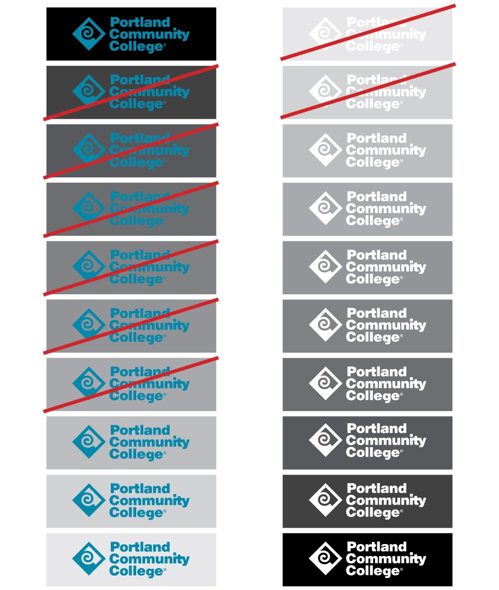
There are several versions of PCC’s primary logo. The turquoise logo is always preferred and should be used at every opportunity. The navy and black versions are additional options and should only be used when the turquoise cannot. The white logo may be used on a dark background if sufficient contrast is needed.
Logo in Brand Colors

Logo in Black and White

Authorized Use
PCC’s registered primary logo may be used for any College-sanctioned activity, provided written consent is obtained prior to its use. Deliberate misuse of the logo will not be allowed. The PCC logo cannot be altered, changed, or modified in any way. It should also never be combined with any other logo. To obtain permission, please contact the Marketing and Communications Department.
Who needs approval to use a logo?
All individuals, organizations, nonprofits and companies are required to obtain written approval before using any of PCC’s registered logos.
Why does PCC care who uses the logo?
The College must control and monitor use of its registered logos to avoid loss or dilution in the marketplace. Inappropriate use of the logo harms PCC’s brand recognition and reputation.
Secondary Logos
These three additional college marks may be used in limited circumstances.
Note: All use of a secondary logo must be approved by PCC’s Marketing and Communications Department.
Monogram Logo
The monogram logo consists of the diamond logomark and initial logotype. The monogram logo is informal and should only be used when the full Portland Community College primary logo is rendered illegible. This usage is primarily for promotional items.

Logomark
The diamond logomark can be used alone in extremely limited circumstances. This mark should not be used as a stand in for the primary logo. It is a special use mark for promotional or spirit items only.

Great Seal
The great seal features the torch of enlightenment, a beacon for all who seek opportunity and education. The great seal is used on official school documents, including certificates, degrees and diplomas. The great seal should not be used for decorative or marketing purposes.
Placement and Clear Space
The logo should appear on all college communications, generally in the bottom right corner.
Care should be taken to ensure the PCC logo’s visibility and impact. No competing visual elements (including text, images, or other logos) should interfere with the logo, nor should it be combined with other logos.
At minimum, the logo should be surrounded on all sides by a clear space that is equal to the distance of the top of the “C” to the bottom of the “g” in the word “College.” More clear space is always encouraged, and will allow for better visibility and impact.

Minimum Size
Minimum size refers to the smallest width advisable for the primary logo. The minimum size for the horizontal logo is 1.375 inches. For electronic applications, the minimum size for the horizontal logo is 99 pixels.

Recommended Sizes
The suggested size for the PCC logo is 1.75″ wide on a typical brochure, and 2.25″ wide on a larger (8.5″ x 11″) publications. For electronic applications, the suggested size of the logo is 99 pixels wide.
For help sizing the logo for a very large application (vehicle wrap, building sign, or the space shuttle), please contact the Marketing and Communications team.

Typical brochure size is 1.75 inches wide.

8.5″ x 11″ paper size is 2.25 inches wide.

Electronic use size is 99 pixels wide. (Example not to scale.)
Background and Contrast
Background colors and images should not compete with the PCC logo or render the logo illegible.
On a white or light solid color background, use the primary turquoise logo. If the logo is placed on a dark background, you may use the white version. For sufficient contrast, reference the examples on this page.
When in doubt, contact the Marketing and Communications team for guidance.
Logo Misuse
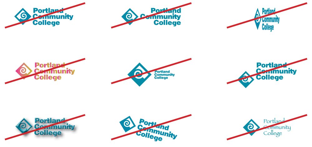
The PCC logo cannot be altered, changed, or modified in any way. It should also not be combined with any other logo.
Do not rotate the diamond, as it should resemble the letter “P.” Do not change the alignment, stretch or condense the logo. Do not change the color, or alter the proportion of the logo. Do not separate or move elements of the logo. Do not add a drop shadow or any other effect to the logo. Do not rotate the logo. Do not change the typeface on the logo.
Special Use Logos
Though characterized by a rich diversity of programs and offerings, PCC is one college that collectively uses the primary logo. The strongest impression is made by the consistent use and implementation of the PCC logo.
In certain circumstances, however, secondary logos are required. These logos are provided primarily for internal spirit-building and community relations (such as community events). Please note that individual course-specific logos do not qualify for a special use logo.
For questions about creation and usage of a campus, center, club, department, program, and resource-specific logo, please contact the Marketing and Communications team for assistance.
Please note: The use of a secondary logo must be approved and created by PCC’s Marketing and Communications department.
Special Logo Examples
Secondary logos are provided primarily for internal spirit-building and community relations (such as community events). Guidelines may be different for monument signage.
History of the PCC Logomark

1960s – PCC is branded with a monogram within a circle inside a square.

Early to Mid 1970s – The type becomes more stylized and adds an arrow. The square and circle are replaced with a border.

Late 1970s – The previous logomark is replaced by a stylized P shape.

1980 to 1985 – The logomark becomes bolder and simplified.

1985 to 1994 – The P becomes ever more stylized, and incorporates the Cs in Community College.

1994 to 2002 – The stylized PCC tilts back 45 degrees and received a tinted diamond-shaped background.

2002 to Current Day – The tinted background is replaced by a solid frame, and the modern PCC diamond is born.

