Choosing a photo
So you need a photo for your website – you have some options! You can:
- Shoot the photo yourself, or ask someone in your department to help.
- If you’re using any students as models, make sure they’ve filled out a media release form, and return the completed forms to the Web Team.
- Use a photo from the PCC photo library.
- Contact Marketing and Communications for help hiring a photographer.
Below are some important things to consider when taking and choosing the perfect photo.
Jump to a component:
Image content
What’s in the photo? Here are some general guidelines to follow for choosing the right subject.
People want to see PCC!
We don’t use stock photography or AI-generated imagery on the website – it looks fake and doesn’t show off real PCC people and places.
The photo’s personality
A few words for inspiration:
- Authentic – show some personality.
- Confident – positivity through facial expressions and body language.
- Try to avoid weird facial expressions – don’t choose photos of people in the middle of talking or eating!
- Engaging – people interacting with each other, an activity, or with the camera.
- Diverse – diversity of age, culture, disability, economic situation, everything is a PCC key value.
- Lively – show hands-on engagement rather than a static group photo, or a room that’s full of people rather than empty.
- For more information, see the PCC brand book (the photography section is on pages 42 and 43).
Don’t worry about exactly matching current PCC conditions
It doesn’t need to be exact – students won’t know or care. A few examples of instances we’ve been asked to unnecessarily remove a photo:
- The room or building in a photo has changed.
- The faculty or staff member has retired.
- The student has graduated.
- Regarding retirement and graduation: If the person has requested we take down their photo, we’ll oblige. Otherwise, if it’s a nice photo why not leave it up?
- It’s “old”, but nothing shown in the photo has really changed.
Let’s not date ourselves
- Unless absolutely necessary, we avoid photos showing older technology (like computers and screen projectors) that make our facilities look dated.
- If the photo is obviously dated (like an old scanned-in image from the 70s), let’s find a new one.
- We try and avoid using graphics using design trends that have long come and gone (sorry dated web buttons).
Image quality
Photos on the website should look good! Images that are dark, blurry, or pixelated make the website look dated, and can lessen the photo’s impact. Photos should be:
- Clear and in focus
- Bright and evenly lit
- Composed well
- Large enough – at least 600px wide.
More on photo sizing
Photos should also be large enough that people can actually see the subject – at least 600px wide. Photos that are too small look a bit silly, and people get annoyed when they can’t see what’s in the picture.
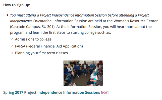
Example of Image quality
Photo that’s too small
Showing a photo of the information sessions being described so people know what to expect is great – just make sure the photo is big enough to see what’s happening in it!

Licensing and copyright
Pay attention to licensing restrictions of images you find online. Unless the owner gives you clear rights to use the image on your website, don’t use it. Some tips:
- Use in-house (PCC-produced) photos. This is the best because they’re authentic and you don’t need to worry about licensing.
- Shoot them yourself, or ask someone in your department to help you.
- Hire a photographer, but remember that attribution (a caption saying “photo credit Jane Doe”) might be required.
- Don’t use Google Images! Almost everything there is someone else’s property.
- You usually can’t use clipart and other graphics, either.
- Look for royalty-free or Creative Commons licensed images. As a last resort, you can purchase a license from a stock photography website.
- Make sure to ask the Web Team before using a royalty-free or purchased image. We don’t use them on the website! They may be ok to use elsewhere though, like in course materials.
- Learn more about image copyright in Spaces.
