Sizing and alignment
Images on the website are one of four different sizes – 100%, 50%, 25%, or thumbnail – and use one of three different alignments – left, right, or center.
Note that you shouldn’t use one of these sizing or alignment classes to create text columns. Instead, learn about making columns.
Jump to a component:
100% width images
100% width images should be landscape (horizontal) orientation, and ideally no taller than 450px. Portrait (vertical) orientation images are too tall and take up too much space on the page when 100% width.
Alignment options
- Yes: Center: Recommended for most images, should be landscape (horizontal) orientation.
- No: Right and left: You can’t align an image to the right or left that is full-width.
Styling
Just like it sounds, these images stretch the full width of the content area.
- Minimum image width for pages without a sidebar: 1000px
- Minimum image width for pages with a sidebar: 650px
How to use for 100% width images
Choose “Add Media” and an image (or edit an image already on the page by clicking on the image and then the pencil icon), then choose “Alignment: Center” and “Size: 100%”.
- Your image will need to be at least 1000px wide. If it’s smaller, “Size: 100%” won’t show up in the options.
- Learn about adding images in WordPress in Spaces.
Note: There is a fourth alignment option (“Alignment: None”), and although this works for 100% width images, adding the “Alignment: Center” option will add a bit of spacing around the image and make it look better when used on a page with text.
Example of 100% width images
The image below is 100% width. Because of that, the text won’t wrap around the image on either side.
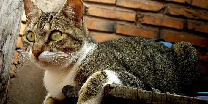 Any text below the 100% width image will appear fully below the image.
50% width images
50% width images can be either landscape (horizontal) or portrait (vertical) orientation, and can be any height.
Alignment options
- Yes: Right: Recommended, can be either landscape or portrait orientation.
- No: Left: Only for special cases (like a logo), should be portrait orientation or square.
- No: Center: Only for special cases (like a logo), should be landscape orientation.
Styling
These images are 50% width of the content area on desktops and tablets.
- Minimum image width for pages without a sidebar: 500px
- Minimum image width for pages with a sidebar: 350px
How to use for 50% width images
Choose “Add Media” and an image (or edit an image already on the page by clicking on the image and then the pencil icon), then choose an alignment option (usually “Alignment: Right”) and “Size: 50%”.
- Your image will need to be at least 500px wide. If it’s smaller, “Size: 50%” won’t show up in the options.
- Learn about adding images in WordPress in Spaces.
Example of 50% width images
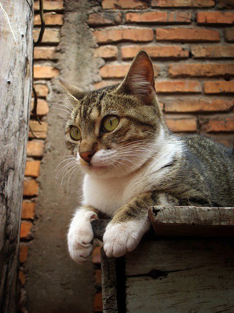 Because this image is 50% width and aligned to the right, the text will flow around it on the left. If the text is long enough to wrap around the bottom of the image, the text will return to stretching all the way across the page.
25% width images
25% width images can be either landscape (horizontal) or portrait (vertical) orientation, although portrait is ideal (landscape photos at this width will be very small).
Alignment options
- Yes: Right: Recommended, should be portrait orientation (landscape is often too small).
- No: Left: Only for special cases (like a logo).
- No: Center: Centered images that are this small look silly.
Styling
These images are 25% width of the content area on desktops and tablets.
- Minimum image width for pages without a sidebar: 250px
- Minimum image width for pages with a sidebar: 175px
How to use for 25% width images
Choose “Add Media” and an image (or edit an image already on the page by clicking on the image and then the pencil icon), then choose an alignment option (usually “Alignment: Right”) and “Size: 25%”.
- Your image will need to be at least 250px wide. If it’s smaller, “Size: 25%” won’t show up in the options.
- Learn about adding images in WordPress in Spaces.
Example of 25% width images
Because this image is 25% width and aligned to the right, the text will flow around it on the left. If the text is long enough to wrap around the bottom of the image, the text will return to stretching all the way across the page.
Thumbnail images
Thumbnail images can be used for things like biography images or logos. Don’t use the thumbnail size for regular images meant to show off your program or organization – they’re too small to display much detail. WordPress crops thumbnail images to square regardless of the orientation.
Alignment options
- Yes: Right
- Yes: Left
- No: Center: centered images that are this small look silly
Styling
These images are 150px wide and square no matter the screen size.
- Minimum image width: 150px
How to use for Thumbnail images
Choose the “Add Media” and an image (or edit an image already on the page by clicking on the image and then the pencil icon), then choose an alignment option (usually “Alignment: Left”) and “Size: Thumbnail”.
- Your image will need to be at least 150px wide. If it’s smaller, “Size: Thumbnail” won’t show up in the options.
- WordPress will crop the image to a square, so either upload a square image or make sure the important part of the image is in the center.
- Learn about adding images in WordPress in Spaces.
Example of Thumbnail images
 Because this image is a thumbnail and aligned to the left, the text will flow around it on the right. If the text is long enough to wrap around the bottom of the image, the text will return to stretching all the way across the page.