MyPCC typography
The fonts, text colors, and text sizes used in MyPCC were carefully chosen to maximize readability and accessibility, as well as maintain a fresh and modern look.
Look through the following pages to see all the typography options available for use.
Development info
- Stylesheet location:
/pcc/styles/helpers/_typography.scss - Learn how to change the font size, style, and weight at the top of the typography basics page in the web style guide.
Fonts
Just like the PCC website, MyPCC uses Open Sans for headings and body text. Learn about Open Sans, font colors, and accessible sizes in the web style guide under fonts.
Headings
Headings are very important for creating a content hierarchy on the page, both for visual differentiation and accessibility reasons. They must be nested properly, and not chosen based on visual sizing. For more information about using headings correctly, visit the writing style guide in Spaces.
Heading usage
No classes or other styles are necessary, and there are no bold, italic, or bold-italic headings.
h1– reserved for the site heading (PCC logo and MyPCC text)

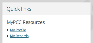
h2– reserved for channel titles (Quick links in the following example)h3– first-level headings in channels (MyPCC Resources in this example)
h4– second-level headings in channelsh5– third-level headings in channels (rarely used)h6– fourth-level (final) headings in channels (rarely used)
Paragraphs
MyPCC uses the same basic paragraph styles as the PCC website. Learn more in the web style guide under paragraphs. All paragraphs are in channels, and no class or other styles are necessary.
Basic paragraphs
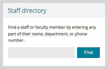
The channel below has a paragraph above the search box.
Devnotes
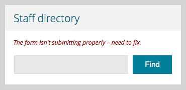
Devnotes are a type of paragraph and are only used for development purposes. Use a devnote to highlight questions or unfinished tasks in a channel in MyPCC Test.
Devnote development info and styling
p class="devnote"orspan class="devnote"- These paragraphs are smaller, red, and italicized.
Links
Most channels have basic text links. For most links, MyPCC uses the same basic link styles as the PCC website. Learn more about links in the web style guide under links. Some of the custom channels have links that look different.
Basic links
Channel with a series of basic links, three in a list and one not.
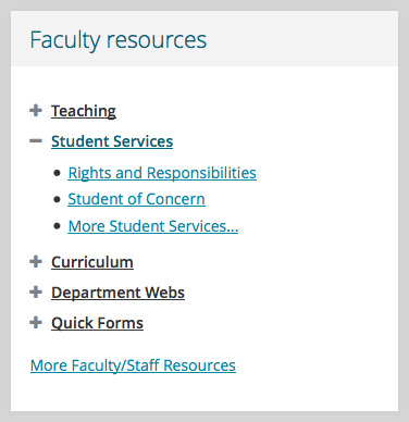
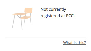
“More” links
More links provide further information about a topic or help users understand the channel. They’re set apart from the main content with a horizontal line and right-aligned text.
More link development info and styling
p class "more-link"with anainside- More links are divided from the rest of the channel’s content by a horizontal line. They are dark gray instead of turquoise.
Buttons
Buttons look basically the same in MyPCC as on the PCC website. Learn more in the web style guide under buttons. All buttons are in channels.
Button development info and styling
- MyPCC uses both HTML
buttonsandinput type="submit"buttons. - Buttons are
disabledwhen not all the required form elements are complete.
The code isn’t exactly like in MyPCC, but buttons look like this:
Lists
MyPCC uses the same basic unordered list styles as the PCC website. Learn more in the web style guide under lists. All lists are in channels and don’t require any classes or additional styling.
Unordered lists
- Unordered lists have bullet points
- The bullet points have a solid fill
Ordered lists
- Ordered lists are numbered
- They use regular numbers rather than Roman numerals or letters
Quotes
One channel uses blockquote: the PCC Corner channel. If other channels need a blockquote in the future, they are set up to use. Quotes in MyPCC look the same as they do on the PCC website. Learn more in the web style guide under quotes.