Info callouts
About this component
Info callouts are the default type, used for all callouts that don’t fall into another category. Use them in line with the main page content to make certain information or links more visible.
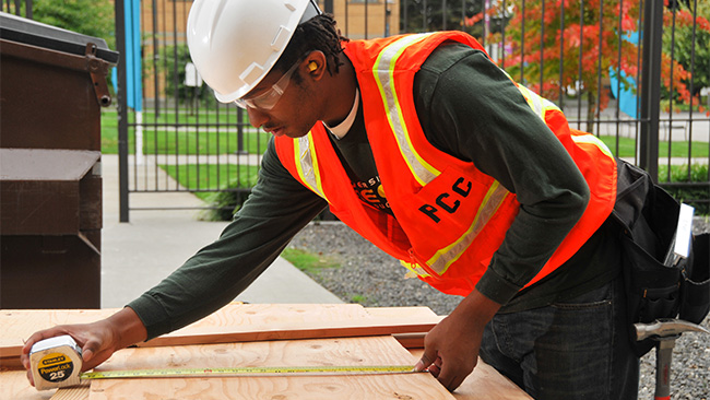
They can include an image (full-width or small and aligned to the right) or a callout icon (not both). Buttons are also optional.
Info callouts are different from other types of callouts because they:
- Are part of the page’s core content – they simply make pieces of content more visible.
- Are permanent.
- Are used in callout galleries.
Styling
Info callouts have gray headings, which match the gray content background. They’re the only type of callout that can include a full-width image above the heading. The image extends to the top and both sides of the callout. Info callouts are usually located in the main callout area, but can be used in the sidebar below the navigation menu.
Responsive behavior for Info callouts
None by default. If using a 50% width callout or a callout gallery, the callouts stack vertically and stretch to 100% width. Callout icons move above the heading on small screens, when applicable.
How to use for Info callouts
Use the callout shortcode (no class necessary).
Development info for Info callouts
Stylesheet location:
/_source/homepage/styles/_cards.scss
- To make the callout 50% width and align it to the right, see 50% width callouts.
- If including a button, you can use a basic button or full-width callout action button.
- Full-width images and callout icons: Put them before the main heading. Make sure there isn’t a paragraph break between the opening callout shortcode tag and the image or icon shortcode, because WordPress will add space above the image. Edit the code view to remove the space, or add the line break with shift + cmd or shift + ctrl.
- Non-full-width image: Use a 25% or 50% width image aligned to the right (see image sizing and alignment). Put them in line with the first bit of content (below the heading).
<div class="info">  <!-- optional: class="card-50" -->
  <img src="" alt="" /> <!-- optional image OR -->
  <i class="fas fa-name callout-icon"> <!-- optional callout icon -->
  <h4>Callout heading</h4> <!-- or <h5> or <h6> -->
  <p>Callout content</p>
</div>
Example of Info callouts
With full-width images
With callout icons
money bill
Financial support
- Find jobs on campus
- STEP (extra help for SNAP clients)
- Scholarships
- Financial aid
50% width with button
Writing good content
Good web practices make sure your content is easy to read and accessible.
This is paragraph text that is aligned to the left. The 50% width callout is aligned to the right, and the text wraps around it. If the text is taller than the 50% width callout, it will stretch the full width of the page beneath the callout.
Full-width with aligned image
Student leadership and government
 Student leadership builds a strong and equitable community. We support clubs, free resources, and civic engagement events to keep campuses informed.
Student government promotes the interests of PCC students. We empower students to enrich their college experience through events and leadership opportunities.


