Homepage tuition chart
About this component
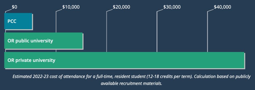
The tuition chart is meant to show, at a glance, how much more affordable PCC is than our university competitors.
Guidelines
Tuition numbers are based on the average cost of one year of in-state tuition for a full-time student. We don’t include individual schools, but rather one category for Oregon public universities and another for Oregon private universities. Other Oregon community colleges aren’t included in the chart.
Marketing provides the tuition amounts on an as-needed basis.
Styling
The chart is a bar graph with three bars, one for PCC, one for Oregon public universities, and one for Oregon private universities. “Oregon” is abbreviated to “OR” for space reasons. The chart is divided by vertical bars that signify cost, starting at $0 on the left and increasing in increments of $10,000 all the way to $50,000 on the right ($50,000 isn’t included though, it’s just the end of the chart). The PCC bar is turquoise and the other bars are green. A description of the chart is below it.
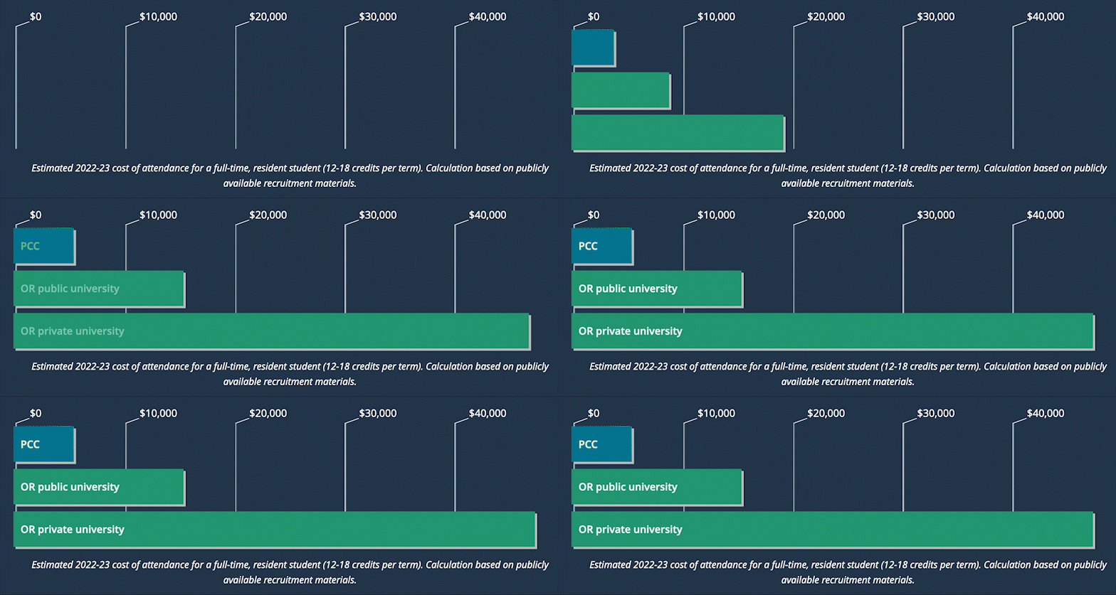
When the chart comes into view as you scroll down the page, the bars animate, growing in size from the left side of the chart to their full width towards the right.
The chart is hidden from screen readers and replaced by a visually-hidden text description.
Responsive behavior for Homepage tuition chart
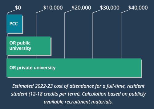
The chart shrinks in size horizontally (not vertically) as the screen size decreases. The amount of space between the $10,000 vertical bars decreases, as does the length of each of the bars.
How to use for Homepage tuition chart
Editable in the HTML and CSS (see “development info”).
Development info for Homepage tuition chart
Stylesheet location:
/_source/homepage/styles/_tuition-chart.scss
- Update the CSS using the tuition amounts provided by Marketing. Only the
100% { }line in each of the 3 keyframes needs to be changed. - Only the text description below the chart needs to be updated in the root-level
index.htmlfile.
@-webkit-keyframes show-bar-pcc-vertical {
  0% {width:0;}
  100% {width:11%;} // $5600 / $50000 = 11% <!-- update the % for the new PCC number divided by 50,000 -->
}
@-webkit-keyframes show-bar-public-vertical {
  0% {width:0;}
  100% {width:31%;} // $15500 / $50000 = 31% <!-- update the % for the new public number divided by 50,000 -->
}
@-webkit-keyframes show-bar-private-vertical {
  0% {width:0;}
  100% {width:95%;} // $52000 / $50000 = 104% <!-- update the % for the new private number divided by 50,000 -->
} <!-- if greater than 95%, still set it to 95% so it gets the point across but the bar doesn't get too close to the edge -->
Example of Homepage tuition chart
Large screens

Small screens

Animation

