Features gallery
Features galleries display lists of related resources or pieces of information. They may or may not link to other pages.
Guidelines
Use features galleries:
- When there are too many items to use a callout gallery.
- When some items have more text than others (this is bad for callout galleries because some boxes have large amounts of empty space).
- When the information is less important than that in callout galleries.
- When you think this gallery works better than others aesthetically.
- When listing related items that don’t link anywhere.
Jump to a component:
- Default gallery
- Large gallery
- Right-aligned gallery
- Gallery with large icons
- Gallery with small icons
Default gallery
Default galleries use images alongside headings and descriptive text.
Styling
These galleries list the items down the page vertically rather than horizontally. They have small (90px wide), left-aligned images alongside the headings and descriptive text. The headings are slightly smaller than the default heading sizes.
Responsive behavior for Default gallery
Images are inline and aligned to the left of their accompanying text on large and medium screens. On small screens, the images move above their text and become as large as they can up to 100% of the width of the screen.
How to use for Default gallery
Use the features-gallery and feature shortcodes (no option needed). There’s a full line break (enter or return) between the opening pcc-feature shortcode tag and the image.
Use images that have the same ratio (ideal but not mandatory) and are at least 90px wide. Don’t use any sizing or alignment classes on the images.
Development info for Default gallery
Stylesheet location:
/_source/styles/components/_features-gallery.scss
<div class="features">
  <div>
    <img src="" alt="">
    <h4><a href="">Heading link</a></h4> <!-- or <h5> or <h6> -->
    <p>Lorem ipsum.</p>
  </div>
  ...
</div>
Example of Default gallery
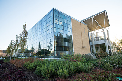
Convenient locations
Four comprehensive campuses, eight centers, and dozens of independent locations throughout the community offer courses and provide student services. Online Learning offers classes online, on television, and through other distance learning methods.
College commitments
Every year, nearly 73,000 students enroll at PCC, making it the largest educational institution in Oregon. These are the values that guide PCC in creating a better future for the community.
Large gallery
Large galleries are the same as default galleries but have larger images.
Styling
Same as default galleries but the images are twice as big (200px wide). The images in this option don’t shrink on medium screens, so it isn’t ideal on pages with a sidebar – the text will get very narrow and be difficult to read.
How to use for Large gallery
Use the features-gallery and feature shortcodes with option="large". Use images that have the same ratio (ideal but not mandatory) and are at least 200px wide. Don’t use any sizing or alignment classes on the images.
Development info for Large gallery
Stylesheet location:
/_source/styles/components/_features-gallery.scss
<div class="features features-large">
  <div>
    <img src="" alt="">
    <h4><a href="">Heading link</a></h4> <!-- or <h5> or <h6> -->
    <p>Lorem ipsum.</p>
  </div>
  ...
</div>
Example of Large gallery
Convenient locations
Four comprehensive campuses, eight centers, and dozens of independent locations throughout the community offer courses and provide student services. Online Learning offers classes online, on television, and through other distance learning methods.
College commitments
Every year, nearly 73,000 students enroll at PCC, making it the largest educational institution in Oregon. These are the values that guide PCC in creating a better future for the community.
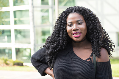
Right-aligned gallery
Right-aligned galleries are good if you want larger images. This option is good for things like staff pages, where there are images of people alongside biographical text. Using a gallery eliminates any image floating/clearing issues that can happen with simple right-aligned images.
Styling
The images will be aligned to the right of the text at 200px width. Headings (with optional links) are the same size as their non-gallery counterparts, and are located to the left of the text.
Responsive behavior for Right-aligned gallery
On medium screens the images have a maximum of 50% width so that the text doesn’t get too narrow. Their behavior is the same as default galleries on small screens.
How to use for Right-aligned gallery
Use the features-gallery and feature shortcodes with option="right". Use images that have the same ratio (ideal but not mandatory) and are at least 200px wide. Don’t use any sizing or alignment classes on the images.
Development info for Right-aligned gallery
Stylesheet location:
/_source/styles/components/_features-gallery.scss
<div class="features features-right">
  <div>
    <img src="" alt="">
    <h4><a href="">Heading link</a></h4> <!-- or <h5> or <h6> -->
    <p>Lorem ipsum.</p>
  </div>
  ...
</div>
Example of Right-aligned gallery
Convenient locations
Four comprehensive campuses, eight centers, and dozens of independent locations throughout the community offer courses and provide student services. Online Learning offers classes online, on television, and through other distance learning methods.
College commitments
Every year, nearly 73,000 students enroll at PCC, making it the largest educational institution in Oregon. These are the values that guide PCC in creating a better future for the community.
Gallery with large icons
Galleries with large icons use round Font Awesome icons alongside headings and descriptive text.
Styling
Same as default galleries but with white icons on teal, circular backgrounds rather than images.
Responsive behavior for Gallery with large icons
Same as default galleries but the images don’t change size on small screens.
How to use for Gallery with large icons
Use the features-gallery and feature shortcodes (no option needed). Use the icon shortcode with class="round round-large" at the beginning of the heading, with a space between the icon shortcode and the heading text. There’s a full line break (enter or return) between the opening pcc-feature shortcode tag and the icon/heading combo.
Development info for Gallery with large icons
Stylesheet location:
/_source/styles/components/_features-gallery.scss
<div class="features">
  <div>
    <h4> <!-- or <h5> or <h6> -->
      <a href="">
        <i class="fa-solid fa-icon-name round round-large"></i> Heading
      </a>
    </h4>
    <p>Lorem ipsum.</p>
  </div>
  ...
</div>
Example of Gallery with large icons
pencil Lorem ipsum dolor sit amet
Sed odio lacus, volutpat non malesuada varius, rhoncus scelerisque leo.
calendar Suspendisse eu eros tellus
Quisque ut ipsum rhoncus, gravida neque in, efficitur nulla.
comments Nunc pellentesque ligula
Curabitur bibendum neque nibh, at dapibus lacus aliquam eu.
Gallery with small icons
Same as galleries with large icons, but the icons are smaller and there are no headings. Links are optional in the description.
Styling
Same as galleries with large images but the icons are half the size.
Responsive behavior for Gallery with small icons
Same as galleries with large icons.
How to use for Gallery with small icons
Use the features-gallery and feature shortcodes with option="round-small" at the beginning of the text, with a space between the icon shortcode and the text. Use the icon shortcode with class="round round-small".
Don’t use headings. Links in the accompanying text are optional.
Development info for Gallery with small icons
Stylesheet location:
/_source/styles/components/_features-gallery.scss
<div class="features">
  <div>
    <p><i class="fa-solid fa-icon-name round round-small"></i> Lorem ipsum.</p>
  </div>
  ...
</div>
Example of Gallery with small icons
pencil Lorem ipsum dolor sit amet sed odio lacus, volutpat non malesuada varius, rhoncus scelerisque leo.
calendar Suspendisse eu eros tellus quisque ut ipsum rhoncus, gravida neque in, efficitur nulla.
comments Nunc pellentesque ligula curabitur bibendum neque nibh, at dapibus lacus aliquam eu.