This content was published: May 8, 2018. Phone numbers, email addresses, and other information may have changed.
Organizing Content in D2L Brightspace
Posted by Rondi Schei
Basic Structure
Note: A student should be able to find all online course materials from the Content area.
D2L Brightspace allows you to organize your content in a modular format. Two of the most common practices is to organize content by week or topic.
Weekly modules are a popular choice for faculty and students as both groups tend to think of the passage of a quarter in terms of weeks. If you have topics that encompass two more weeks, organizing by topic might work better as long as you don’t need sub-modules to break up your content.
Regardless of the organizational method you use:
- List your course materials in the order you would like your students to review them.
- Make sure your content item titles are meaningful.
- Consider adding descriptions to select items (these act as the “prompt” you might say in class as you pass out the document).

- If you add a video from YouTube, TedTalks, Vimeo, etc, use the option “Video or Audio” from Upload/Create instead of “Create a Link.” This provides a video icon below the title.

- Make sure to include links to all your course learning activities (i.e. Discussions, Quizzes, Assignments) in appropriate modules.
- If you use a publisher website for activities, include a link to the website in each module and consider using a short description to remind the students what activities must be completed through the platform.

- Some instructors choose to add separate link to the platform login page for each activity, so that the due dates can be added to the Brightspace Calendar – something students love to see!
Using sub-modules
Something to be very careful of is the use of sub-modules. These should only be used in specific instances. Before I get to what those are, let me explain what the student experiences when viewing content this way.
When a student clicks on a top level module (i.e. Week 1), the sub-modules visually appear as nice boxes around content (i.e. Readings, Activities).

Having this categorization seems like a great way to provide visual interest and focus, but what you might not know is that it adds an additional layer of navigational complexity to your course. For instance:
- Let’s say that the student clicks on the “Readings” sub-module from the Table of Contents, then the student is taken to that sub-module only and can no longer see the items in the Week 1 module or the Due this Week sub-module.

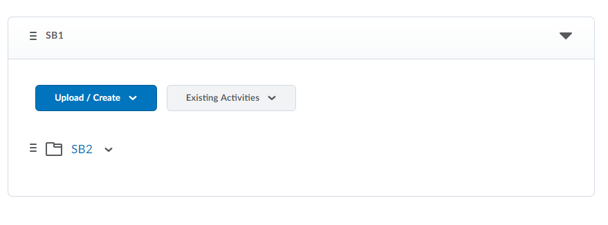
- If you have a sub-module in a sub-module, from the top level module it is denoted by a folder icon before the sub-module title. Students don’t see what is in that module until they go into the sub-module.

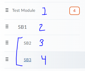
- In the Table of Contents, there is no way to distinguish a 4th level module from a third level module. (i.e. Test 1 > SB1 > SB2 > SB3). Submodule 2 and submodule 3 look like they are both 3rd level modules.

- Many students navigate content by clicking on the arrow button at the top of the page after clicking on the first content item for the top level module (i.e. in Week 1). When sub-modules are included, clicking the arrow keys does not take the student to the content item in the next sub-module.

Instead, they are taken back to Content and into the sub-module only. They then must click on the first item in the sub-module to view. When they have viewed the last item in the sub-module, they are taken back to the top of the “Week 1” module and now must scroll down to the next item below the sub-module. - Instructors who add brief descriptions to content items may be disappointed to know that the only way to view that description is to click on the sub-module first from the Table of Contents. So, if a student navigates from the top level folder only, they will not see the description.
So now you know some reasons why the use of sub-modules can be problematic for navigating content. When is it a good idea to use sub-modules?
- If you have a lot of content in each module. By that I mean more than 12-15 items. (I have that many, about 15 items in my Weekly modules, and it still looks just fine. In these cases, try to limit to one sub-module and place it at the end of your top level content items.
- If you have a large group of content items that may not be required, but useful. For example, I have used a submodule for “Study Aids” with about 5 to 7 items. I place it at the end of my main module content items.
How can I categorize without sub-modules?
Instead of using sub-modules, you can do other practical or creative things to categorize your content. For instance:
- You can create a naming convention:
- Reading 1: What is economics about?
- Reading 2: Microeconomics vs. Macroeconomics
- Reading 3: How Economists Understand Economics Issues

- You can use icons to accompany descriptions to provide a visual cue as to the content item type. I have created a Google Drive folder that is full of free to use icons!

Need more ideas?
Are you interested in a spring clean? If you are someone who has a large number of content items in each module or uses multiple sub-modules within one top-level module, take advantage of an Instructional Technology Specialist (campus and online courses) or set up an appointment with me (online courses) to brainstorm other options. There are many ways to consolidate the number of content items you have too!


This is great, Rondi! I’m going to get rid of my sub-modules today! It’s nice to have another opinion on how many items is too many before moving content to a sub-module.
Rondi was great to work with when I realized that even my face to face students were struggling with submodules. (I could see them in class not being able to navigate them.) So, together (Rondi and myself) we came up with icons that help visually organize my course content!
I can appreciate this no-submodule advice, but I’m struggling with it a bit. I am teaching a synchronous remote-due-to-COVID19 class that would normally be F2F. I have long used Modules corresponding to each class period, and have until now used submodules much as you described the two cases above. This time, in order to maximize flexibility, the students have options how they earn certain points (participation and homework) in the course. For each day I have the same 4 submodules: Before class, During Class, If You Miss Class, and After Class. There are up to 24 items distributed among some days’ submodules. I have carefully avoided any further layers of submodules for many of the same reasons you cited above. I am already using dedicated icons to indicate which type of grade points, if any, each activity can earn. Of course, as you point out, since the icons are in the description, the students can’t see the icons unless they drill into the submodule. I’ve never actually watched students try to navigate this, though. I’m not sure how many layers of icons students can sort through (eg, if I had icons for the four categories rather than submodule names), as opposed to layers of submodules. Any thoughts?
How do you reorganise the layout of the Assignments list? I’ve tried the Reorder options, but that doesn’t seem to help…
-EJR
Just wanted to share a huge thank you from NYU for this resource. Your website is a tremendous source of wisdom and experience for us as we roll through our implementation, and I’ve learned a lot from your team. Thank you, PCC!